Contents
This is a div block with a Webflow interaction that will be triggered when the heading is in the view.
I've been working in web design across Suffolk and Cambridgeshire for over a decade now, and I've noticed something interesting. Businesses invest thousands in building beautiful websites, but often miss simple tweaks that could double or triple their enquiry rates.
These aren't major design flaws or expensive problems. They're usually small usability issues that slip through the cracks during the build process - things that seem minor but quietly add up to serious lost revenue.
Here's what makes this even more critical right now: the way people search is fundamentally changing. With AI-powered search engines like ChatGPT, Perplexity, and Google's AI Overviews, the old playbook of just ranking well isn't enough anymore. These systems prioritise websites that genuinely answer user questions, provide clear value, and offer excellent user experiences. If your site is slow, confusing, or hard to navigate, you're not just losing human visitors – you're also being deprioritised by AI systems that are increasingly deciding which businesses get recommended.
This shift towards Answer Engine Optimisation (AEO) means the fundamentals have never mattered more. User experience, clear content, and technical performance aren't just nice-to-haves, they're essential for visibility in this new landscape.
The good thing? Most of these issues are surprisingly straightforward to fix once you know what to look for. And the improvements can be dramatic.
Whether you're running a consultancy in Cambridge, a retail business in Newmarket, or a trade operation anywhere across Suffolk, there's probably at least one quick win on this list that could make a meaningful difference to your customer conversions.
1. Page Speed Could Be Costing You Half Your Mobile Visitors
Here's a stat worth paying attention to: according to Google's research on mobile page speed, 53% of mobile visitors abandon sites that take longer than three seconds to load. Three seconds. That's barely enough time to blink.
The challenge is that page speed issues often aren't obvious to the site owner. When you visit your own website, it's usually cached in your browser, so it feels fast. Meanwhile, first-time visitors on mobile data are having a very different experience.
Why this happens: The biggest culprit is almost always images. Someone's uploaded photos straight from their camera at 5MB each, and the website's groaning under the weight. Add in a few bloated plugins, unoptimised code, and cheap hosting, and you've got yourself a proper mess.
The actual fix: Start with your images. Before you upload anything, run it through a free compression tool like TinyPNG or Squoosh. You can often reduce file sizes by 70-80% without any visible quality loss.
If you're on WordPress (like most small businesses), install a caching plugin. WP Rocket's brilliant if you've got the budget, or W3 Total Cache if you're watching pennies. These create static versions of your pages so they load instantly.
For Suffolk SEO specifically, page speed is a confirmed ranking factor. Google's made that crystal clear. But here's what's becoming equally important: AI search engines factor in page speed when deciding which sites to reference in their answers. If your site takes too long to load, AI systems like ChatGPT and Perplexity are less likely to recommend you, even if your content is spot on. This is part of the broader shift towards Answer Engine Optimisation, AI systems prioritise sites that provide excellent user experiences.
If your site needs more fundamental web design work to address speed issues properly, that's an investment worth making now rather than later.
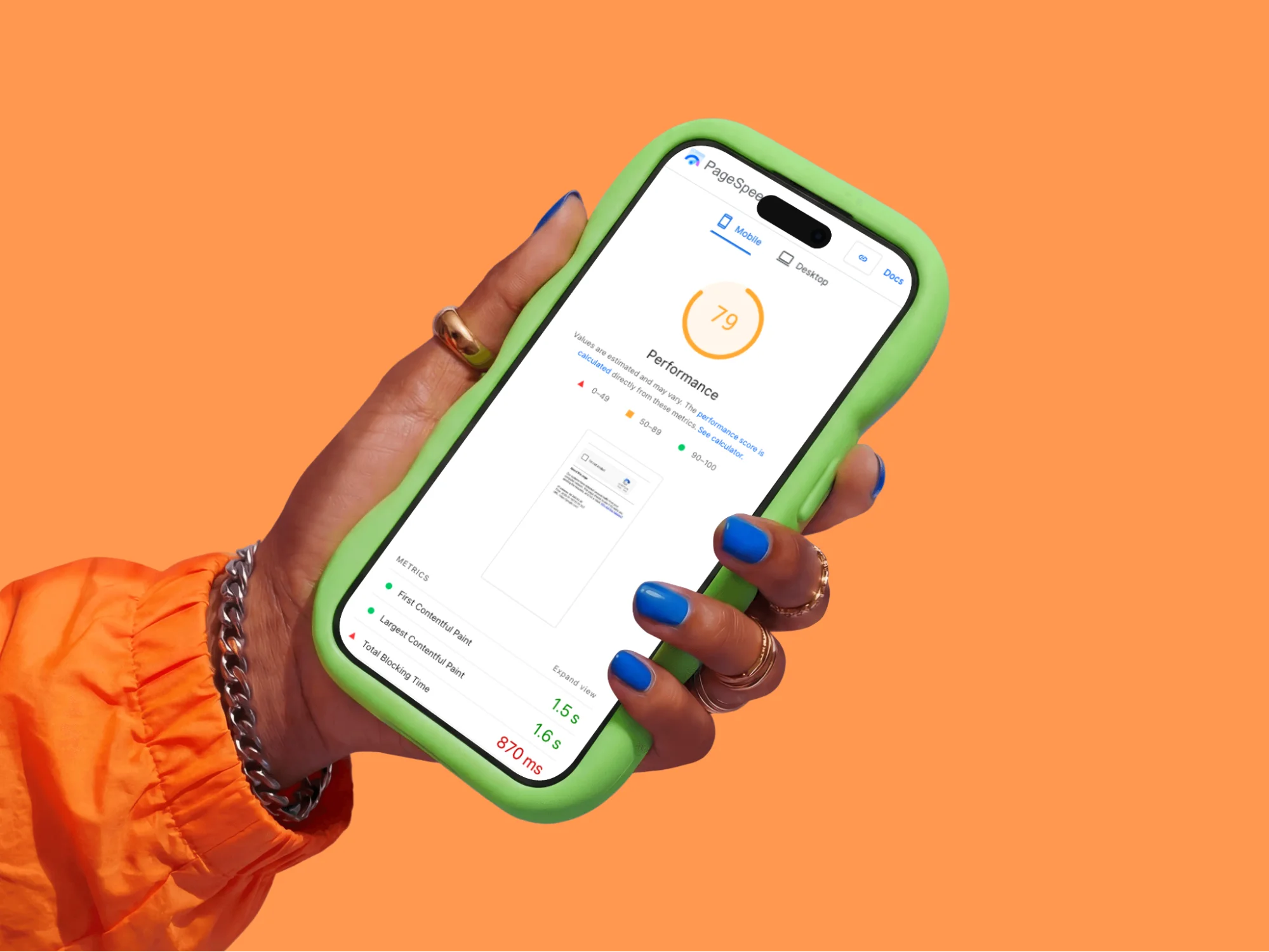
Make it practical: Right now, this minute, go to Google PageSpeed Insights and test your website. If your mobile score's below 50, you need to treat this as urgent. Start with the "Opportunities" section, it tells you exactly what's slowing you down and how much time you'd save by fixing each issue.

2. Mobile Experience Isn't Getting the Attention It Deserves
More than 60% of all web traffic now comes from mobile devices. That's the majority of potential customers viewing your site on phones, probably whilst multitasking or on the move.
The tricky thing about mobile optimisation is that it often looks fine when you're testing it yourself. You know where everything is, you're patient with your own site, and you might be testing on a newer phone with a bigger screen. Real users aren't quite so forgiving.
Why this happens: Either the site was built before mobile became dominant (and never updated), or the designer only ever tested it on their massive desktop monitor. Sometimes businesses get shown a mobile version during the design phase, say "yeah, looks fine," and never actually try to use it themselves.
The actual fix: Your website needs to be responsive. That's not a nice-to-have anymore – it's baseline functionality. The site should automatically adapt to whatever screen size someone's using, whether that's an iPhone SE or an iPad Pro.
If your current site isn't responsive, there's no patch or quick fix. You need a rebuild. But this is non-negotiable for modern web design in Suffolk or anywhere else – particularly now that AI search engines assess mobile usability when determining which sites to recommend in their answers.
When getting a new site built, insist on reviewing mobile mockups. Better yet, get a test version loaded onto your actual phone before you sign anything off. Use it properly. Try to fill in the contact form. Try to find your phone number. If it's frustrating for you, it's frustrating for customers.
Make it practical: Get your phone out right now and open your website. Can you tap your phone number to call without zooming in? Can you navigate the menu easily? Can you fill in your contact form without wanting to throw your phone at the wall? If any answer's "no," you're losing customers every single day.
3. Contact Information Sometimes Gets Lost in the Design
This one's surprisingly common. A business invests in professional web design, gets everything looking polished, but in the pursuit of clean aesthetics, the contact details end up being harder to find than they should be.
Sometimes the phone number's in the footer in small text. Sometimes it's only on a contact page that requires an extra click. Sometimes the primary contact method is a form that goes to an inbox that isn't checked regularly enough.
Why this happens: Sometimes designers prioritise clean aesthetics over function. Sometimes businesses worry about spam calls (which, fair enough, but you're also blocking real customers). Sometimes it's just oversight.
The actual fix: Your phone number needs to be visible in the header of every single page. Make it clickable on mobile so people can tap to call. No exceptions.
Have a dedicated contact page that's easy to find – ideally in your main navigation. On that page, give people options: phone, email address, contact form, physical address if you've got premises. Some businesses add WhatsApp or live chat if they can actually staff it.
For local Suffolk SEO, having your complete address and local phone number helps Google understand where you operate. It's not just about user experience – though that's the main thing – it genuinely helps your rankings for local searches.
Make it practical: Open your website on your phone. Time how long it takes you to find a phone number you can actually call. If it's more than two seconds, you're losing emergency jobs and impulse buyers. Those are often your most profitable customers.

4. Contact Forms Are Asking for Too Much Information, Too Soon
There's a natural tension here. Businesses want to gather enough information to provide relevant responses and filter out time-wasters. But there's a point where comprehensive forms start working against you.
According to research from Formstack, every additional form field decreases conversion rates. Their data shows that reducing fields from 11 to 4 can increase conversions by 120%. That's a significant difference.
Why this happens: Businesses want to "qualify leads" before wasting time on tyre-kickers. Or they want to gather information to personalise their response. Both understandable goals. Both counterproductive on a first-contact form.
The actual fix: Strip your main contact form down to absolute essentials. Name. Email. Phone number. Message. That's it. Four fields.
Everything else – budget, timeline, project details – you can ask about once someone's actually engaged with you. Get them in the door first, then have the conversation.
If you genuinely need more information for specific services, use a multi-step form that only shows relevant questions based on what someone selects. But test this properly – you might be surprised how much better a simple form performs.
Make it practical: Look at your contact form right now. For each field, ask yourself: "Do I absolutely need this information to start a conversation?" If the answer's "not really" or "it would be nice to know," delete it. You can always ask later.
5. Design Can Date Faster Than You'd Think
Here's something that catches a lot of businesses off guard: websites age faster than you might expect. What looked contemporary five years ago can start to feel dated, and that matters more than many people realise.
There's research showing that when visitors land on a site that looks older, they sometimes question whether the business is keeping pace with their industry. It's not necessarily fair, but it's a real psychological response.
Why this happens: Websites age. What looked cutting-edge in 2015 looks neglected in 2025. Many businesses build a site once and then forget about it, focusing on their actual work instead of their online shopfront.
The actual fix: You don't need a complete rebuild every year – that's neither practical nor necessary. But a proper refresh every 3-4 years keeps you looking current and trustworthy.
Modern web design (whether in Suffolk or anywhere else) tends toward clean layouts, plenty of white space, strong typography, and high-quality photography. Avoid anything that dates quickly: autoplaying background videos, excessive animations, parallax scrolling everywhere, or those rotating slider carousels that nobody actually clicks through.
Work with someone who understands contemporary design principles but won't chase trends just for the sake of it. Your website should look professional in five years, not just five minutes.
Make it practical: Open your website alongside three successful competitors. Be honest – does yours look noticeably older or more cluttered? Ask people outside your business for their first impression. If multiple people say it looks dated, it probably does. Trust that feedback.
6. SEO Often Gets Overlooked in Favour of Design
You can have an absolutely stunning website, but if potential customers can't find it on Google, it's missing a huge opportunity.
This happens more often than you'd think: businesses invest heavily in beautiful web design but SEO either gets treated as an afterthought or gets missed entirely. Sometimes it's because SEO feels technical and complicated. Sometimes it's because the designer and the business owner simply had different priorities during the build.
Why this happens: SEO feels complicated and technical. Some businesses don't realise how crucial it is. Others get burned by dodgy agencies who promise page one rankings and deliver nothing but keyword-stuffed nonsense that Google actively penalises.
The actual fix: Start with fundamentals. Every page needs a unique, descriptive title tag (what shows up in Google results) and a meta description that actually makes people want to click.
Use relevant keywords naturally in your content. If you do web design in Suffolk, say that – but write it in actual sentences, not weird unnatural phrases crammed in everywhere.
For local businesses, create location-specific content. If you serve Cambridge and Newmarket, have dedicated pages explaining your services in those areas. Don't just copy-paste the same content with different town names – Google spots that immediately.
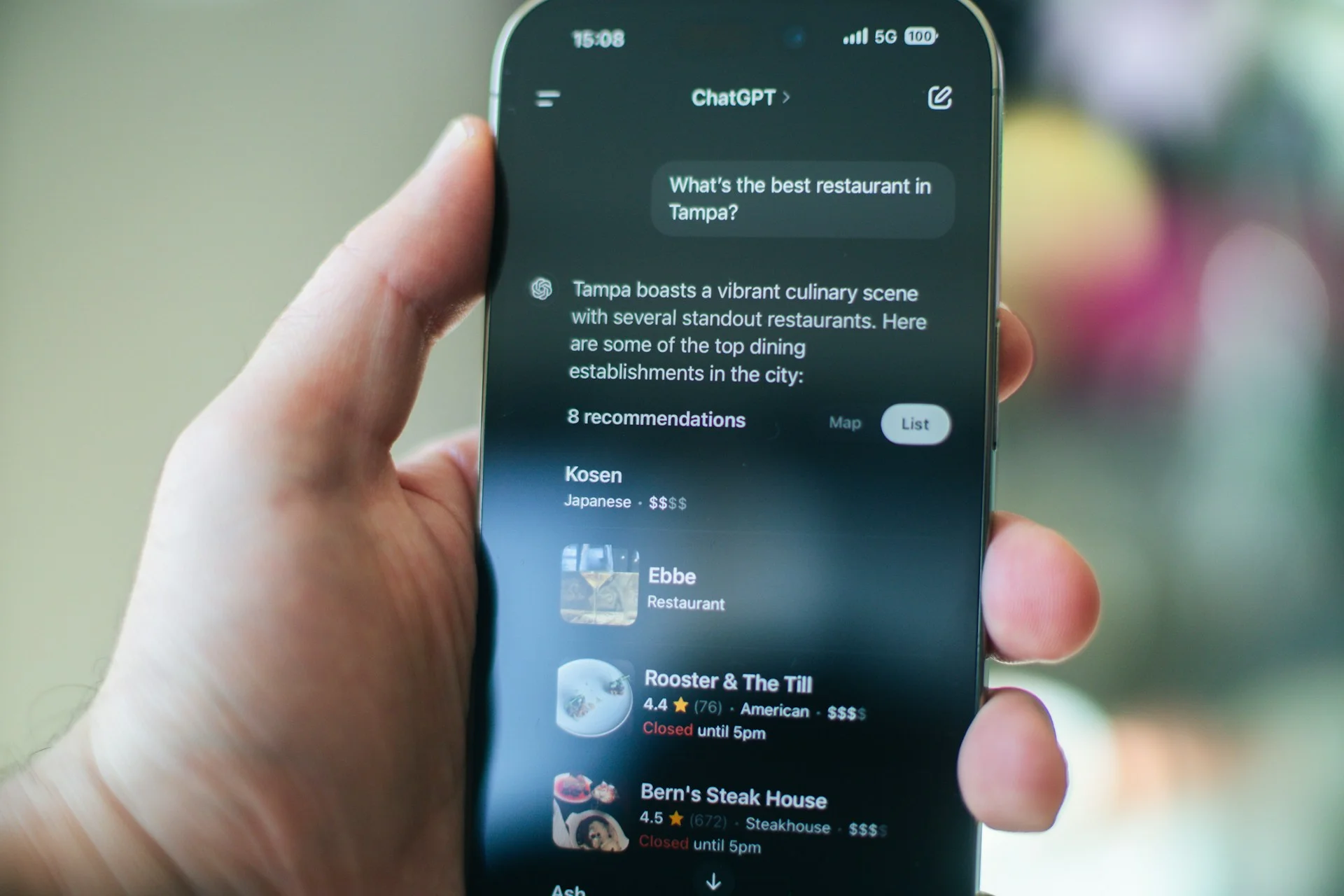
Here's where things get interesting with AI search: traditional SEO focused on ranking for specific keywords. Answer Engine Optimisation (which we've written a detailed guide on here) takes a different approach. AI systems like ChatGPT, Perplexity, and Google's AI Overviews look for content that directly answers user questions, provides comprehensive information, and demonstrates genuine expertise.
This means your content needs to be written for humans first, search engines second. Answer the questions your customers actually ask. Provide real value. Be specific and detailed. AI systems are getting very good at distinguishing between content written genuinely to help users and content written just to game rankings.
If you need help developing a proper SEO strategy that works for both traditional search and AI-powered systems, it's worth getting expert input rather than trying to piece it together yourself.
Get your Google Business Profile sorted. Keep it updated. Gather reviews (genuine ones – buying fake reviews is a fast track to getting delisted). Build citations in local directories. These signals tell Google you're a legitimate local business.
Make it practical: Google your main service plus your location. "Accountant Cambridge" or "plumber Newmarket" or whatever you actually do. Where do you show up? If you're not on page one for your core services in your primary locations, you're invisible to most potential customers. That needs addressing urgently.
7. Differentiation Isn't Always Coming Through Clearly
Many business websites struggle with the same challenge: explaining what makes them different from competitors in a way that actually resonates.
The About Us pages often end up sounding similar across an industry. "We're committed to excellent service." "We put our customers first." These statements might be true, but they don't help potential customers understand why they should choose you over the business down the road saying exactly the same things.
Why this happens: People struggle to articulate their value proposition. It's easier to fall back on generic corporate speak than to really examine what makes your business worth choosing. Sometimes business owners are too close to their own work to see what's actually distinctive about it.
The actual fix: Get specific about what you do differently. Not "quality service" – everyone claims that. Real, tangible differences.
Do you respond to enquiries within an hour while competitors take days? Say that. Do you offer a particular guarantee or process that others don't? Explain it. Have you got specialist experience in a specific niche? Make that clear.
Use real examples and case studies. Don't tell me you're great at problem-solving – show me a problem you actually solved for a real customer. Names changed if necessary, but make it concrete.
This is increasingly important for AI search systems. When someone asks ChatGPT or Perplexity "which web design company should I use in Suffolk?", the AI looks for sites that provide detailed, specific information about what makes businesses different. Generic claims get ignored. Specific examples, processes, and outcomes get referenced.
This applies to your web design Suffolk content too. Don't just list services. Explain outcomes. What actually changes for customers when they work with you? The more detailed and specific you can be, the better you'll perform in both traditional search and AI-powered recommendations.
Make it practical: Look at your homepage and About page. Could you swap your business name for a competitor's and have it still make sense? If yes, you're not being specific enough. Rewrite those sections to include things only your business can truthfully say.
8. The Next Step Isn't Always Obvious to Visitors
Someone lands on your homepage. They're interested in what you do. They're ready to take action. But what should they do next? If that question doesn't have a clear answer, there's a missed opportunity.
Research from the Nielsen Norman Group shows that clear calls-to-action significantly improve conversion rates. The challenge is that when you're close to your own business, it's easy to assume the next steps are obvious when they might not be to a first-time visitor.
Why this happens: Either the website was designed without thinking about user journeys, or there's a mistaken belief that more options equals better service. In reality, too many choices leads to decision paralysis.
The actual fix: Every page should have a primary action you want visitors to take. On most pages, that's probably "Contact Us" or "Get a Quote" or "Book a Call." Make that button prominent. Use contrasting colours. Place it above the fold and repeat it at the bottom of longer pages.
Be specific with your call-to-action text. "Submit" is rubbish. "Get Your Free Quote" or "Book Your Free Consultation" or "Download the Guide" tells people exactly what happens when they click.
For service businesses especially, remove friction. Don't make people jump through hoops. The easier you make it to contact you, the more people will actually do it.
Make it practical: Look at your five most-visited pages (Google Analytics will tell you which they are). For each page, identify what you want someone to do next. Is that action obvious and easy? If you have to think about it, your visitors definitely won't figure it out.
9. Trust Signals Could Be Stronger
When someone's considering using a business they haven't worked with before, especially for anything significant, they naturally look for reassurance. They want to know others have had good experiences. They want to see credentials. They want proof you're legitimate and capable.
The challenge is that trust-building elements often get deprioritised during website builds. Everyone's focused on getting the core pages done, and social proof elements end up being "we'll add those later" – except later sometimes doesn't happen.
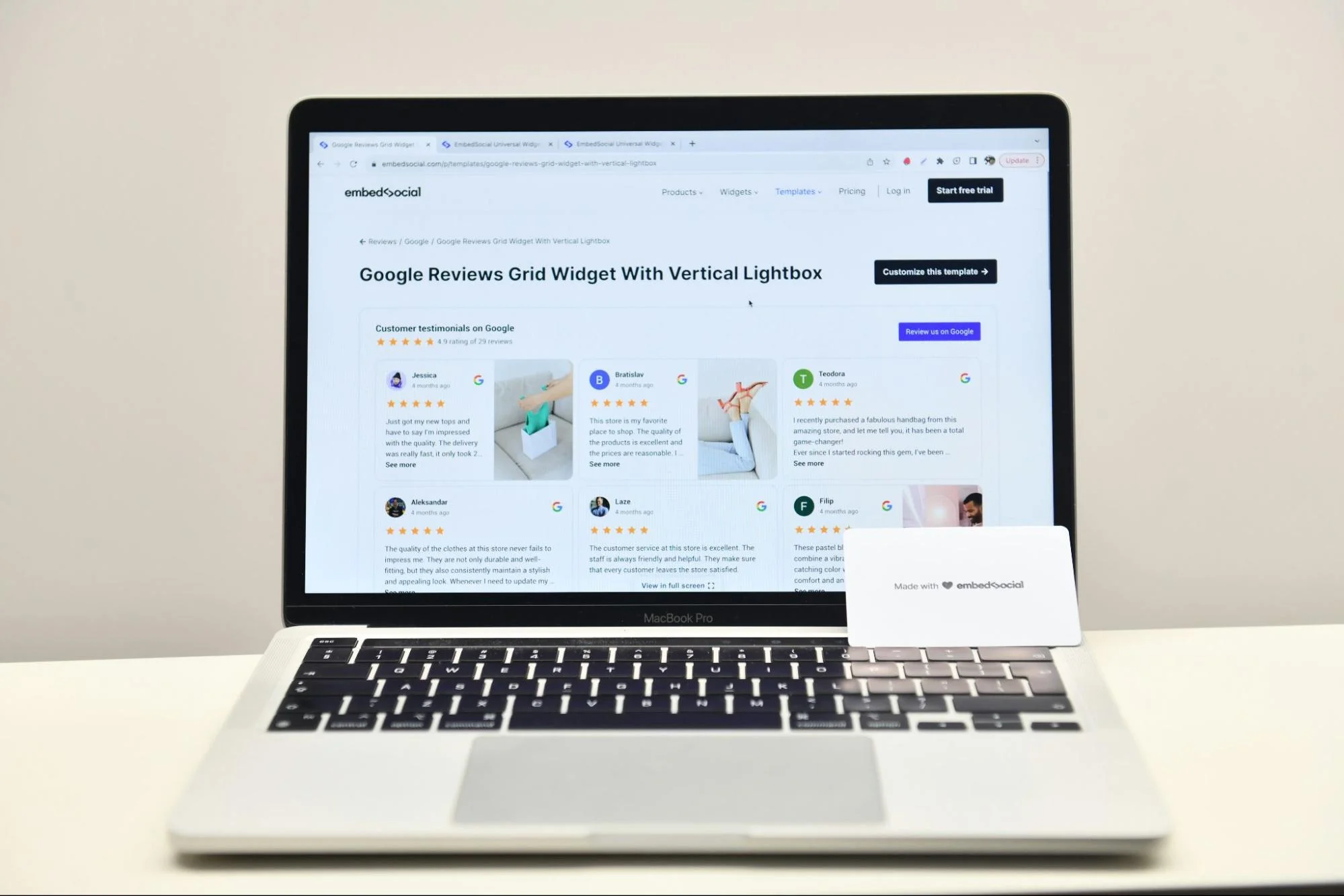
The actual fix: Include multiple types of social proof throughout your website. Customer testimonials with real names and photos (generic "John from London" quotes look fake because they usually are). Case studies showing specific results. Logos of recognisable clients or suppliers, if you've got them.
Display any relevant accreditations, memberships, or awards. If you're a Which? Trusted Trader or Checkatrade member, show those badges. If you've won local business awards, mention them.
For Suffolk SEO purposes, customer reviews on your Google Business Profile are gold dust. They help rankings and they build trust. Encourage happy customers to leave reviews – not by paying them or offering incentives (Google prohibits that), but by simply asking.
Make it practical: Count how many testimonials are visible on your website right now. If it's fewer than five, you need more. Reach out to satisfied customers and ask if they'd be willing to provide a quick testimonial. Most people are happy to help if you make it easy for them.
10. Analytics Aren't Being Used to Their Full Potential
Here's something I notice with a lot of small businesses: they've got analytics installed, but they're not really using the data to make decisions. Sometimes it's not even set up properly, so the numbers aren't telling the full story anyway.
The thing about analytics is that it feels technical and time-consuming. Most business owners are focused on actually running their business, and diving into Google Analytics doesn't feel like the best use of their time. But without some basic insights, you're making decisions based on guesswork rather than reality.
The actual fix: Get Google Analytics 4 installed and configured correctly. If you're not sure it's set up right, it probably isn't – this is worth getting a professional to check. Make sure it's tracking conversions (form submissions, phone calls, whatever matters for your business).
Set aside 20 minutes once a week to review your data. You don't need to understand every metric. Focus on what matters: How many visitors are you getting? Where are they coming from? Which pages do they visit most? Where do they drop off?
Look at your traffic sources. If you're investing in Suffolk SEO but getting no organic traffic from Google, something's wrong. If you're paying for ads that aren't converting, you need to change something.
Make it practical: Log into Google Analytics right now. Can you find it? Do you know your login details? If not, that's your first problem. Once you're in, look at your traffic for the last month. Is it going up, down, or staying flat? What's your most popular page? That tells you what people are actually interested in.

The Bottom Line (And What to Actually Do About It)
Here's what I've learned from working with hundreds of businesses across Suffolk and Cambridgeshire: website issues rarely come from one big catastrophic problem. It's usually several small things that add up.
A loading time that's just a bit too slow. Contact details that require one extra click. A form with a few too many fields. A mobile experience that's slightly more friction than it needs to be. None of these seem dramatic in isolation, but together they can significantly impact your conversion rates.
The good news? Once you know what to look for, most of these problems are fixable. Some need professional help from a decent web design Suffolk agency. Others you can sort yourself this afternoon.
Here's why fixing these issues matters more now than ever: We're in the middle of a fundamental shift in how people find businesses online. AI-powered search systems – ChatGPT, Perplexity, Google's AI Overviews, and others – are becoming the primary way people get recommendations. These systems don't just look at keywords; they assess whether your site provides genuine value, answers questions thoroughly, and offers an excellent user experience.
The websites that win in this new landscape are the ones that get the fundamentals right: fast loading, mobile-friendly, easy to navigate, clear calls-to-action, and content that genuinely helps users. This is what Answer Engine Optimisation is all about – we've written more about AEO here if you want to understand the bigger picture.
Traditional Suffolk SEO focused on gaming algorithms. Modern SEO and AEO focus on genuinely serving users. Which, when you think about it, is how it should have been all along.
Start with the quick wins:
- Test your site on mobile right now and fix any obvious issues
- Make your phone number prominently visible and clickable
- Reduce your contact form to four fields maximum
- Compress your images to speed up loading times
- Set up Google Analytics if you haven't already
Then tackle the bigger projects:
- Audit your SEO and create a realistic improvement plan
- Refresh outdated design elements that make you look neglected
- Develop clear calls-to-action throughout the site
- Gather fresh testimonials and social proof
- Review your analytics regularly and actually use the insights
Your website should be working for you 24/7, bringing in leads whilst you're asleep, on holiday, or focused on actual client work. If it's not doing that, something on this list is probably the culprit.
The businesses winning in Cambridge, Newmarket, and across Suffolk aren't necessarily the ones with the biggest budgets or the flashiest websites. They're the ones who've got the fundamentals right, who've removed friction from their user journey, and who've made it genuinely easy for customers to choose them.
Sort these issues out, and you'll be one of them.

Matt is the founder of Main Ambition, a web and SEO agency helping SMEs compete online with bigger, better-resourced businesses. Over the past decade, he's built websites and run ad campaigns for businesses across East Anglia, turning digital underdogs into genuine contenders. When he's not obsessing over tech and marketing strategy, you'll find him trekking through Suffolk with Dylan, his fox-red labrador.
Sources
Here I've provided a list of the sources of information and tools I've mentioned in the content of this article. I hope you find them useful in your pursuit of website excellence.
- Google - Mobile Page Speed Research
- https://www.thinkwithgoogle.com/marketing-strategies/app-and-mobile/mobile-page-speed-new-industry-benchmarks/
- Source for: 53% of mobile visitors abandon sites taking longer than 3 seconds to load
- Statista - Mobile Web Traffic Statistics
- https://www.statista.com/statistics/277125/share-of-website-traffic-coming-from-mobile-devices/
- Source for: 60%+ of web traffic comes from mobile devices
- Formstack - Form Conversion Report
- https://www.formstack.com/resources/form-conversion-report
- Source for: Reducing form fields from 11 to 4 can increase conversions by 120%
- Nielsen Norman Group - Conversion Rates
- https://www.nngroup.com/articles/conversion-rates/
- Source for: Clear calls-to-action improve conversion rates
- Google PageSpeed Insights
- https://pagespeed.web.dev/
- Free tool for testing website speed and performance
- Google Mobile-Friendly Test
- https://search.google.com/test/mobile-friendly
- Tool for checking mobile usability
- Google Search Central - SEO Starter Guide
- https://developers.google.com/search/docs/fundamentals/seo-starter-guide
- Official Google guidance on SEO fundamentals
- Google Business Profile
- https://www.google.com/business/
- Platform for managing local business presence on Google
- Web.dev - Performance Best Practices
- https://web.dev/performance/
- Google's guidance on website performance optimisation
- Mozilla Developer Network - Responsive Design
- https://developer.mozilla.org/en-US/docs/Learn/CSS/CSS_layout/Responsive_Design
- Technical guidance on responsive web design
Image Compression Tools Mentioned:
- TinyPNG
- https://tinypng.com/
- Free image compression tool
- Squoosh
- https://squoosh.app/
- Google's image compression tool
Analytics & Testing Tools:
- Google Analytics 4
- https://analytics.google.com/
- Website analytics platform
- GTmetrix
- https://gtmetrix.com/
- Alternative page speed testing tool
- Hotjar
- https://www.hotjar.com/
- User behaviour and heatmap analytics


.webp)